

Every architecture diagram I have shared has hit the same wall. The boxes are right and the arrows are right, but the first question is always "so where does the request go first?" A static picture shows every component at once, so the viewer has to guess the order. Then I end up on a call, tracing the path with my cursor, box by box.
Animation fixes that. When the client appears first, then the load balancer, then the API, the diagram tells the story in the same order I would tell it out loud. This guide covers how to create animated architecture diagrams from start to finish: why, the five main methods, the tools, the habits that make an animation easy to follow, and which export format to pick. I build ByteDiagram, so I will say where it fits, and also when another tool is the better choice. If you would rather follow along with clicks, the hands-on companion is how to animate an architecture diagram step by step.
Why animate an architecture diagram at all?
An architecture diagram has two jobs. It shows what exists, and it explains how things interact. A static image is great at the first job and weak at the second. Animation helps in a few specific ways:
- Order becomes visible. The viewer sees that the cache is checked before the database, instead of reading it from a caption.
- Attention goes where you want it. If only one new component appears at a time, nobody is reading the bottom corner while you talk about the top.
- Different paths get their own moment. The happy path, the cache miss and the async job can each be a separate beat instead of a tangle of arrows.
- It works without you. An animated diagram in a README or a post explains the flow when you are not in the room.
Animation is not always the answer. A reference diagram that people scan to find one service name should stay static. Animate when the order matters and the audience needs the story, not just the map.
The five main ways to animate an architecture diagram
1. Timeline or step reveal
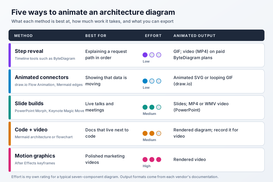
The diagram is built in one place, and each component or connection gets a position on a timeline. Playback reveals them in order, the way you would explain a system on a whiteboard: draw the client, draw the arrow, draw the next box. It is the method I reach for most, because the layout never moves and the viewer only tracks what is new.
2. Animated connectors (data flow)
Here every component is visible from the start, and the lines carry the motion: dashes or dots travel along the arrows to show data moving. It is the quickest way to make a diagram feel alive and suits continuous traffic, such as a stream into Kafka. What it does not show well is sequence, because everything moves at once. I often combine it with a step reveal: reveal the components in order, and let the connectors flow once they are on screen.
3. Slide builds
For a live talk, slides work fine: duplicate the slide, add the next component on the copy, and let a transition animate the change. Microsoft's Morph transition guide describes exactly this setup: two slides with at least one object in common, with Morph applied to the second slide so objects move smoothly between them. The same page notes that Morph does similar things to Magic Move in Keynote. The downside is upkeep. Every step is a separate slide, so renaming one service means editing it on every slide.
4. Code-based: Mermaid plus video
If your diagrams live next to your code, Mermaid is worth a look. Its architecture diagram syntax (introduced in v11.1.0) describes groups, services and edges in plain text, and its flowchart docs show how to give an edge an ID and turn on animation for it, with fast and slow speeds. That gives you animated connectors in a diagram you can review in a pull request. There is no step reveal timeline, so for a walkthrough you record the rendered diagram or build each step as its own diagram.
5. Motion graphics (After Effects style)
For a polished product video, motion graphics tools give you full control. Adobe's After Effects animation basics explain the model: you animate a property such as opacity or position by setting keyframes, and After Effects interpolates the values between them. You can make anything move exactly as you want, but you also have to animate everything yourself, which is a lot of work for a diagram that will change next sprint.
Tools that can animate architecture diagrams
Here is what each tool actually offers for architecture diagrams, based on its own documentation as of October 2026.
- ByteDiagram. Built around the step reveal. It has a system architecture diagram type, a tech icon library with groups for AWS, Azure, Google Cloud, databases and messaging, and a Timeline menu with a bottom timeline, a sequence builder and a timeline builder. Each line can also have a Flow toggle for moving connectors. Presentation mode steps through the diagram with the arrow keys. Exports include PNG, SVG and PDF, an Animated GIF with lines in motion, and a Timeline GIF that reveals components one by one. MP4 video export is on the paid plans; the free plan includes GIF export.
- draw.io (diagrams.net). Its connector animation docs show how to turn on Flow Animation in the Style tab, with settings for flow duration, timing and direction. Export to SVG keeps the animation for web pages, and animated GIF export loops it. It is free and great for animated connectors, but has no step reveal timeline.
- PowerPoint. Morph handles slide builds, and Microsoft's guide to turning a presentation into a video covers exporting as MP4 or WMV, with animations and transitions included.
- Mermaid. Text-based architecture and flowchart diagrams with animated edges, as above. Best when the diagram should be versioned with code.
- After Effects. Keyframe animation and rendered video. Best for marketing pieces where polish matters more than speed.
If you want a broader comparison of static diagram tools, I wrote an honest comparison of ByteDiagram, draw.io, Lucidchart and Visio.
Plan the animation before you open any tool
The best animated diagrams I have made started as a numbered list, not a canvas. Before drawing anything, I write the flow as short sentences:
- The browser sends a request.
- The CDN serves static files from the edge.
- The load balancer picks an API instance.
- The API checks the cache.
- On a miss, the API reads the database.
- Slow work goes onto a queue.
Each sentence becomes one step. If a sentence needs the word "and", it is probably two steps. The list also tells you what should be visible at the start: usually just the client, so the viewer has an anchor.
Best practices that make animated diagrams easy to follow
One idea per step
Each step should add one component or one connection, and explain one thing. If three boxes appear at once, the viewer has to work out which one matters. If you cannot describe a step in a short sentence, split it.
Keep the layout still
Place every component in its final position from the start, and only change what is visible. When boxes slide around, people lose track of what they have seen. With a timeline there is one layout, so it cannot drift.
Use consistent icons and colors
Pick one icon style and stick to it, not a cylinder for one database and a logo for the next. Give color a meaning, such as one color for the request path and another for async work.
Pace it for reading, not for watching
People need time to read a label after it appears. I keep steps short and even, with a little extra time on the step that carries the main point. In ByteDiagram, the automatic order gives every element a one-second duration, and I usually only slow down the key moment. End on the complete diagram and hold it, so the last frame works as a summary.
Label the arrows
An arrow that says "GET /orders" or "publish job" explains itself. Short labels on the lines do more for clarity than any amount of motion.
Give failure paths their own beat
Show the happy path first. Then add the retry, the fallback or the dead-letter queue as a separate step, ideally in a different line style.
Export formats: which one to use where
- GIF plays almost everywhere: READMEs, docs, chat and social posts. It loops and has no sound, which suits a short diagram. ByteDiagram gives you two kinds, a whole-diagram Animated GIF and a step-by-step Timeline GIF, and draw.io exports connector animation as a looping GIF.
- Animated SVG stays sharp at any size on web pages that allow SVG. draw.io keeps connector animation in its SVG export.
- MP4 video is the right choice for YouTube, course platforms and slides. ByteDiagram offers MP4 on its paid plans, and PowerPoint exports MP4 or WMV.
- PNG, SVG or PDF are your static fallback for printed docs and reviews. Always keep one; not every audience needs the motion.
- Live presentation is often best for a meeting: step through the diagram and talk over each step.
Which method should you choose?
- Explaining a request path in order, for onboarding, design reviews or system design content: a timeline step reveal.
- Showing continuous data flow on a diagram that is otherwise static: animated connectors in draw.io or ByteDiagram.
- A one-off conference talk: slide builds with Morph or Magic Move.
- Diagrams that live in the repo: Mermaid with animated edges.
- A launch video with a motion designer on hand: After Effects.
For a general, non-architecture walkthrough of animated diagrams, see how to create animated diagrams for free. If you already have a flowchart you like, converting a flowchart to an animated diagram is a quicker starting point. And when you are ready to build one, the step-by-step tutorial walks through a full web app example.
FAQ
What is the easiest way to create an animated architecture diagram?
Use a tool with a step reveal timeline. You draw the diagram once, set the order in which components and connections appear, and export the result. In ByteDiagram that means adding tech icons, setting the order in the sequence builder, and exporting a Timeline GIF. If you only need moving arrows, draw.io can animate connectors.
Can I create animated architecture diagrams for free?
Yes. draw.io is free and can animate connectors, exporting them as animated SVG or a looping GIF. ByteDiagram has a free plan that includes GIF export, both the whole-diagram Animated GIF and the step-by-step Timeline GIF. MP4 video export in ByteDiagram is on the paid plans.
What is the best export format for an animated architecture diagram?
GIF is the safest choice for READMEs, docs, chat and social posts because it plays almost everywhere. MP4 video suits YouTube, course platforms and slides. Animated SVG stays sharp on web pages that allow SVG. Keep a static PNG, SVG or PDF as a fallback for printed docs and reviews.
Can draw.io animate an architecture diagram?
draw.io can animate connectors. Select the connectors, enable Flow Animation in the Style tab, and adjust the flow duration, timing and direction. Exporting to SVG keeps the animation, and animated GIF export loops it. It does not have a timeline for revealing components one at a time.
How many steps should an animated architecture diagram have?
Use one step for each idea you need to explain, usually one component or one connection per step. If a step needs the word and to describe it, split it. If the animation gets long, split the diagram into two, such as the request path and the async path, instead of speeding everything up.
Animate your first architecture diagram
Open the editor, drop in a few tech icons, set the reveal order on the timeline, and export a GIF that explains the flow on its own. You can start without an account.
Open Diagram Editor